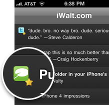 The future is here – more and more handhelds are being built with high definition screens. The iPhone ships the Retina display, while on the Android (as of August 02, 2010) HDPI accounts for more than 50% devices.
To web developers, there is clearly a need to build high density compatible web sites.
First, the theory
A DPI stands for dots per inch meaning the number of pixels your device can fit within an inch. Higher DPI devices fit more pixels on to screen of the same size, resulting in sharper picture. Compared to your regular desktop screen, Android HDPI fits 1.5 times more pixels on the same amount of space, while the Retina doubles the amount of pixels of a desktop screen and the previous iPhone generation.
Pixel is not a pixel
To a developer the key is the notion of CSS vs device pixel. If you have a web page size of say, 400 pixels, on a desktop screen and iPhone 3 you’re going to see a page occupying exactly 400 pixels of device screen. However, on a Retina screen, that 400 pixels occupies 800 pixels of space. The Retina display, having double the DPI amount, needs to scale the page in order to occupy the same amount of physical space. If it didn’t, it would just display the page to a portion of space (400 pixels) and the rest of it (240 pixels) would get wasted.
So the important aspect is the ratio of device to CSS pixel: how much space the original design (CSS pixel) accounts on the actual device screen. The webkit word for it is the -webkit-device-pixel-ratio. See the table below for an overview of various device pixel ratios.
| Device | Resolution | Device-pixel Ratio |
| Android LDPI | 320×240 | 0.75 |
| Iphone 3 & Android MDPI | 320×480 | 1 |
| Android HDPI | 480×800 | 1.5 |
| Iphone 4 | 960×640 | 2.0 |
The problem
Having more pixels is all that nice when it comes to text, but once your page is zoomed in, the images get scaled beyond their original size. Due to scaling algorithm you lose the clarity of the pictures. Buttons, graphics, icons and anything bitmap related gets blurred.
The solution
Obvious one: you need to provide a properly sized image assets, each with a different DPI.
Using the CSS media queries this is fairly easy:
<link rel="stylesheet" media="screen and (-webkit-device-pixel-ratio: 0.75)" href="ldpi.css" />
<link rel="stylesheet" media="screen and (-webkit-device-pixel-ratio: 1.0)" href="mdpi.css" />
<link rel="stylesheet" media="screen and (-webkit-device-pixel-ratio: 1.5)" href="hdpi.css" />
<link rel="stylesheet" media="screen and (-webkit-device-pixel-ratio: 2.0)" href="retina.css" />
Basically the device-pixel-ration of 2.0 or higher will use the retina.css. Note that you could go without the retina.css, in which case hdpi.css would be applied to both Android HDPI and iPhone Retina displays. You can also specify these in a single stylesheet:
#header {
    background:url(mdpi/bg.png);
}

@media screen and (-webkit-device-pixel-ratio: 1.5) {
    // CSS for high-density screens
    #header {
        background:url(hdpi/bg.png);
    }
}
Amongst other things to try is to avoid bitmap graphics altogether and go with the vector (SVG) format where it makes sense. The trend is clearly into making high density compatible web sites, and using these simple CSS rules makes it easy.
Related
Qt Development: Working with zip files on Symbian
If you are working on an application targeted for Symbian phones, one of the easiest ways to work with zip files is to use existing APIs available on Symbian OS. This is a short blog post that will show you how to use those APIs from your Qt application.
Maven release plugin – 8 tips & tricks
Recently I’ve been working intensively with Maven and it’s release plugin and I wanted to share…
A bird’s eye view on Samsung Smart TV Apps development
If you own a TV, I’m sure that at some point you found yourself wishing it was loaded with software. Despite of a less enjoyable visual experience, our smartphones are already loaded with all kinds of apps. So what’s the hold up in the TV department?